At the centre of its brand, the client wanted an abstract shape to symbolise the variety of products it offered. The solution involved four coloured circles that cut into each other to form a 3D icon which suited the scientific nature of the business. This was then expanded into a visual identity and applied across various marketing materials.
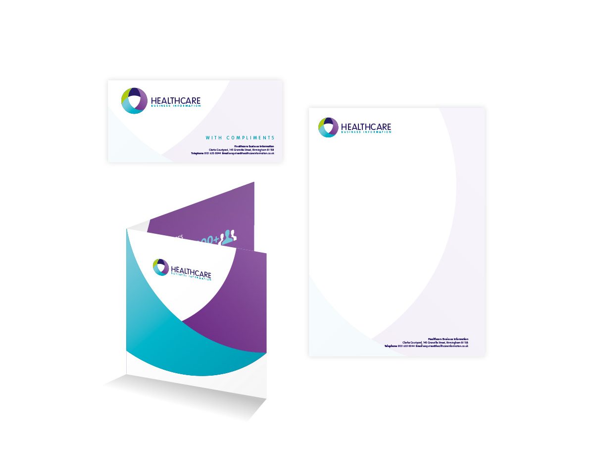

The different colours of the abstract circle device were then used to create different sub-brands, each linking back to the umbrella logo.
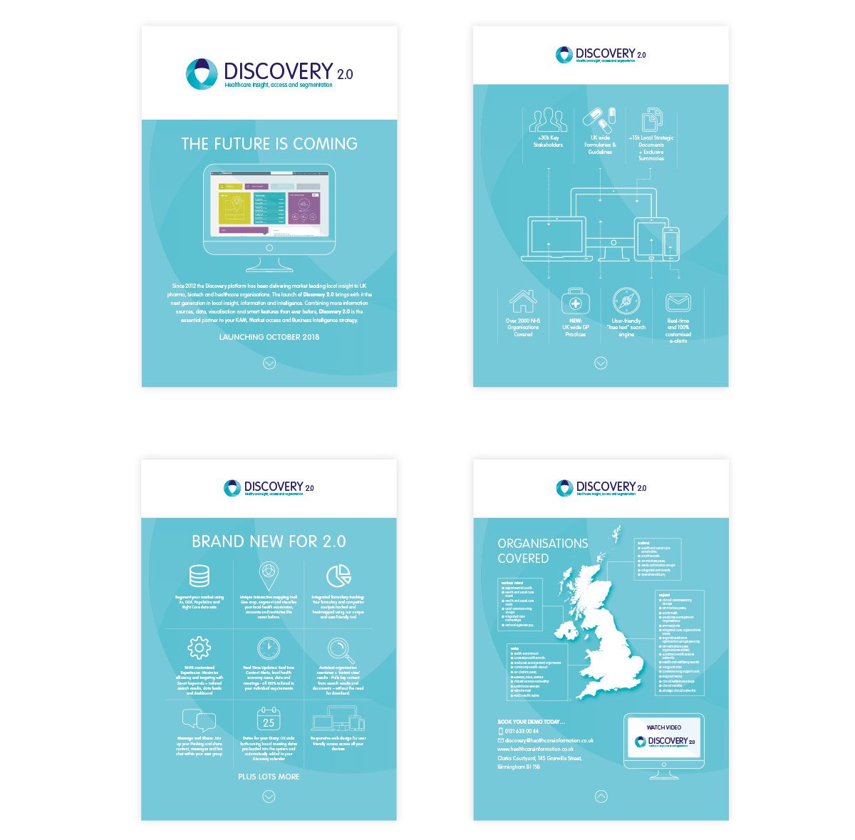
The project included a series of clean and stylish infographics which formed part of the company’s marketing communications.